Don't Text Drive Poster

click for larger view
The "Don’t Text & Drive” poster campaign was designed as a Public Service announcement for young drivers between the ages of 16-29 about the dangers of texting while driving. The poster is meant to be displayed at the local DMV or any driver education school.
What makes this design differ from typical “Government and State Official” informational posters is my design is less corporate & more organic; identifying itself with a more youthful & desensitized generation, using minimal gore to drive home the shock-value aspect.
What makes this design differ from typical “Government and State Official” informational posters is my design is less corporate & more organic; identifying itself with a more youthful & desensitized generation, using minimal gore to drive home the shock-value aspect.
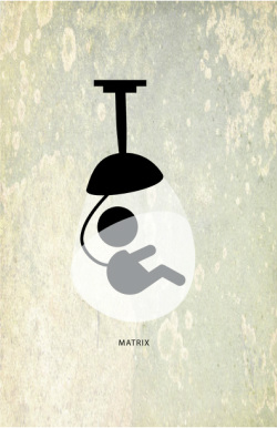
Matrix Minimalist Poster
click for larger view
The Sci-Fi movie "The Matrix" was the inspiration for this design using simple geometric shapes & forms.
Attributing the theme that people are essentially used as energy by technology in the future, I created a geometric shaped baby inside a pod with a tube sticking out of it as the iconic metaphor of what the movie is about.
The concept is abstract just enough to lead the potential movie goer to wonder what the baby means & what kind of contraption it is in.
Horror Movie Poster

click for larger view
The Barn Horror Movie poster was designed as a class project for my image editing project at Moorpark College. Its appeal is for all movie horror buffs as well as any fan of gore or suspense films. This poster is meant to be displayed at movie theaters and movie promotional areas.
What makes it differ from typical horror movie posters is the graphic quiet imagery & bloody gore type. I actually took the picture of the barn so it is organic in its imagery and different from typical horror movie poster layouts.
What makes it differ from typical horror movie posters is the graphic quiet imagery & bloody gore type. I actually took the picture of the barn so it is organic in its imagery and different from typical horror movie poster layouts.
The I In Diversity

click for larger view
The "I" In Diversity poster was designed for Moorpark College's 2013 Multicultural Day. The subtle white background and color coded continents help to differentiate the cultural diversity of various nations, while the stick figure pictographs illustrate the similarity in all of us.
What makes my design different from others is the double meaning of using the continent shapes as pictograph people to allow the mind to put visualize the open shapes as closed forms.
This design won the 2013 Multicultural Day Poster of the year award for the Moorpark College Multicultural Day Ceremony.
Nursery Monster

click for larger view
The Nursery Monster logo was created for a client using 2 different typefaces & a Illustrator drawn monster eye. The client wanted to use the playful complimentary colors of pink & green as well as the eye as corporate symbol
